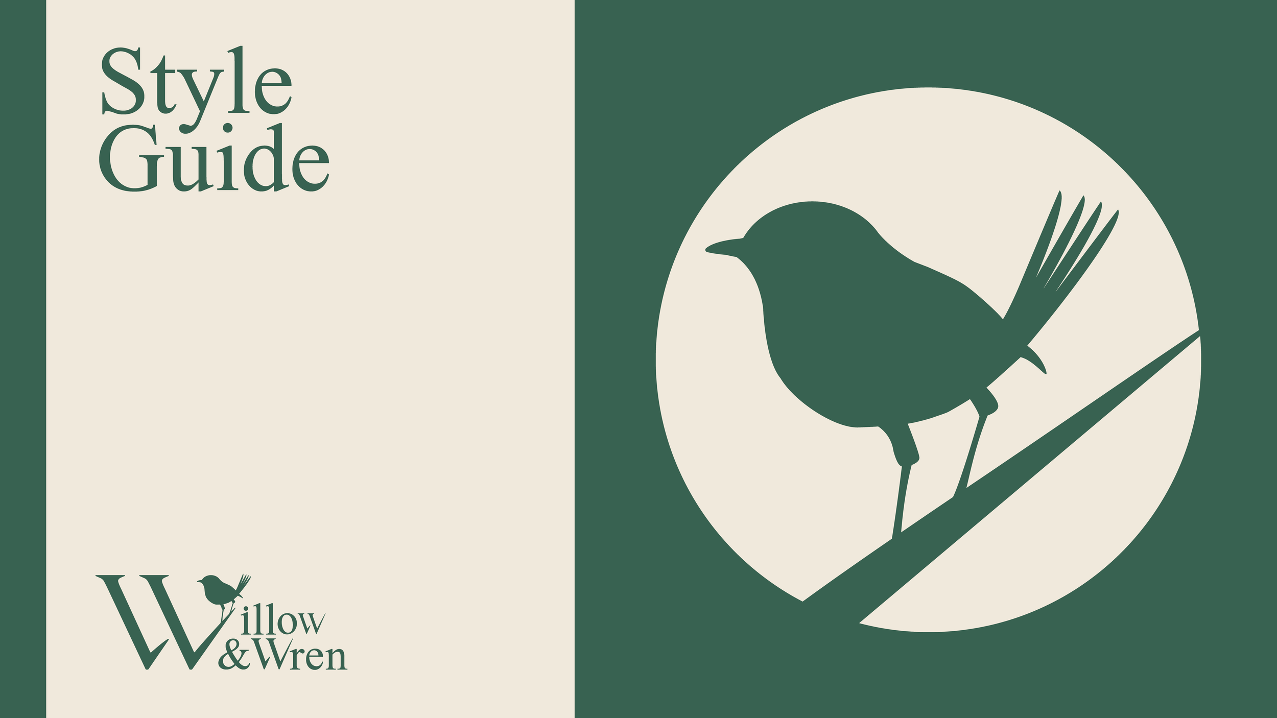
Willow & Wren Branding and Guidelines Document
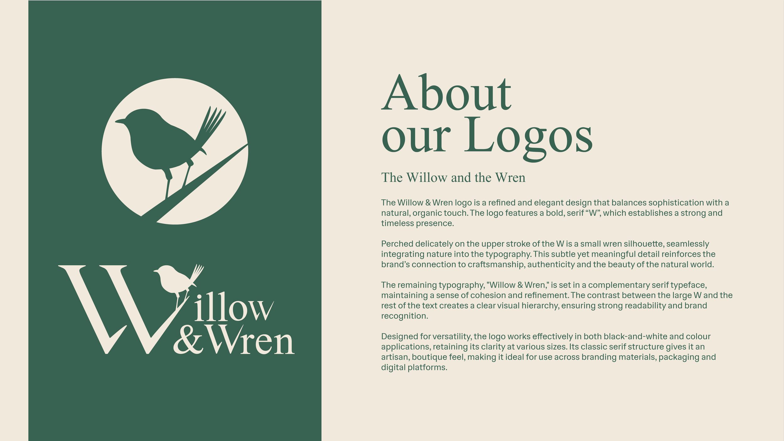
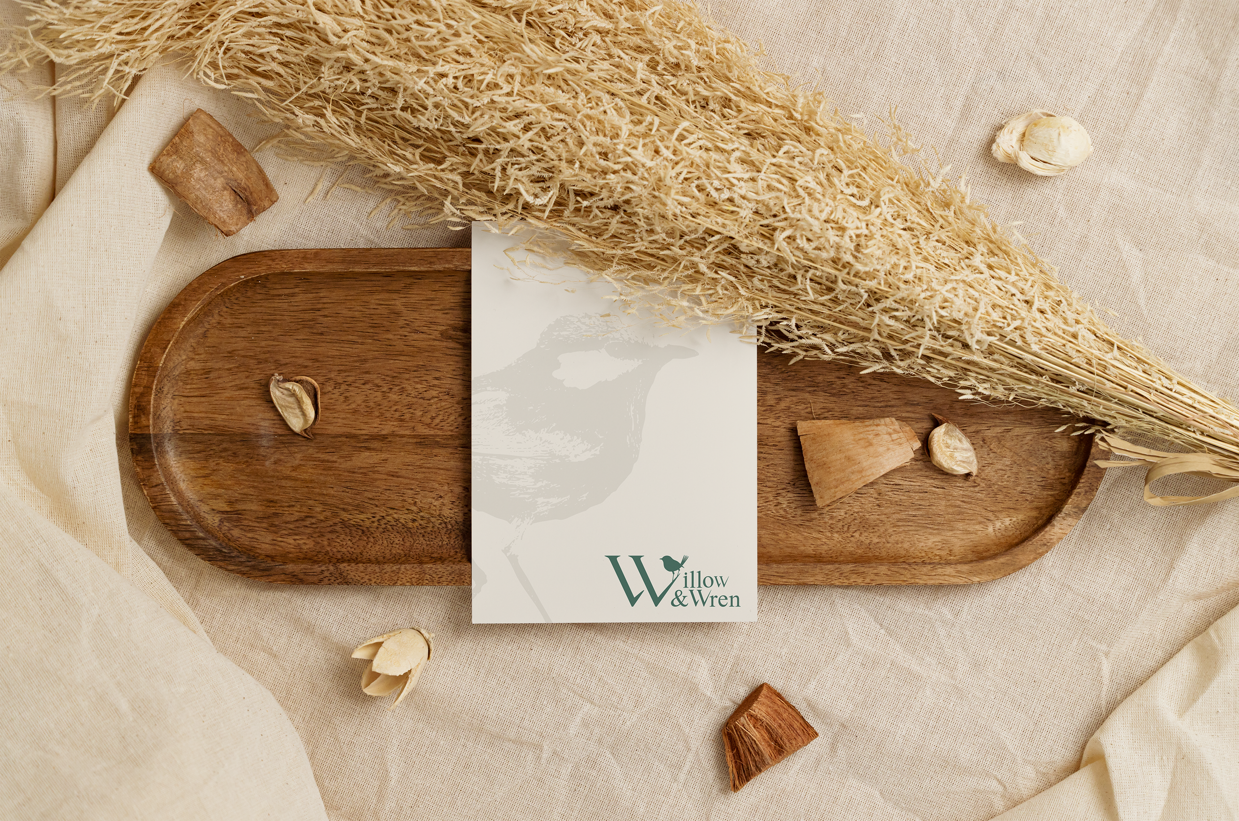
The Willow & Wren logo was designed to capture the brand’s essence of elegance, nature and craftsmanship. The concept combines a bold, classic serif typeface with a delicate wren perched on the “W”, symbolizing a harmonious blend of strength and refinement. This design reflects the brand’s connection to organic elements while maintaining a timeless and sophisticated aesthetic.
The balanced typography ensures versatility across various applications, from print to digital. The logo’s minimal yet thoughtful design allows it to stand out while maintaining an air of understated elegance, making it a perfect representation of the Willow & Wren brand identity.